The goal of this usability audit is to highlight the UX and UI issues of the product.
GOAL:
Reflectly iOS App - Usability Audit

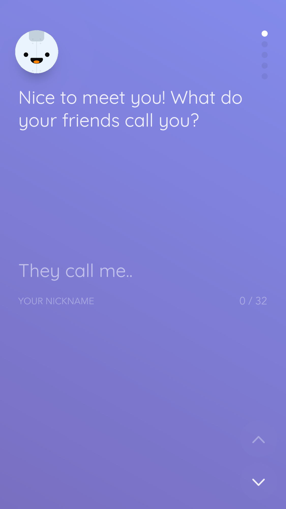
Should I click ‘They Call Me’ or ‘Your Nickname’?
IxD issue
It’s unclear whether I should click ‘They Call Me’ or ‘Your Nickname’. Which field do I enter my name into? First I attempted to click ‘Your Nickname’.
Solve
Have a cursor blinking at the end of ‘They Call Me’ to indicate this text is ready to be changed.
End the confirmation
I prefer apps that don’t require entering a password twice, like how Simple Habit handles setting a password. Nowadays, it’s becoming more common and acceptable to not have the confirmation field.
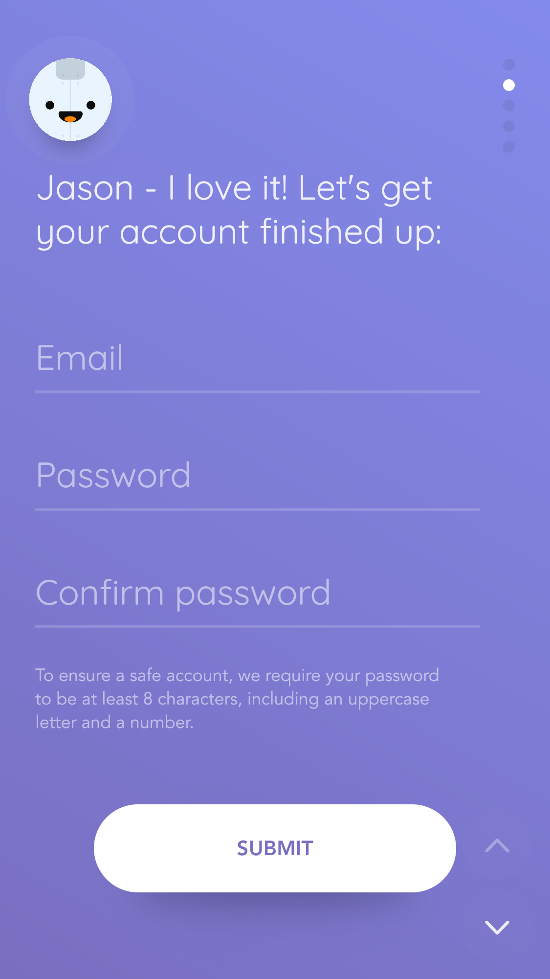
Not having a confirmation field is faster.
Fine Print and $
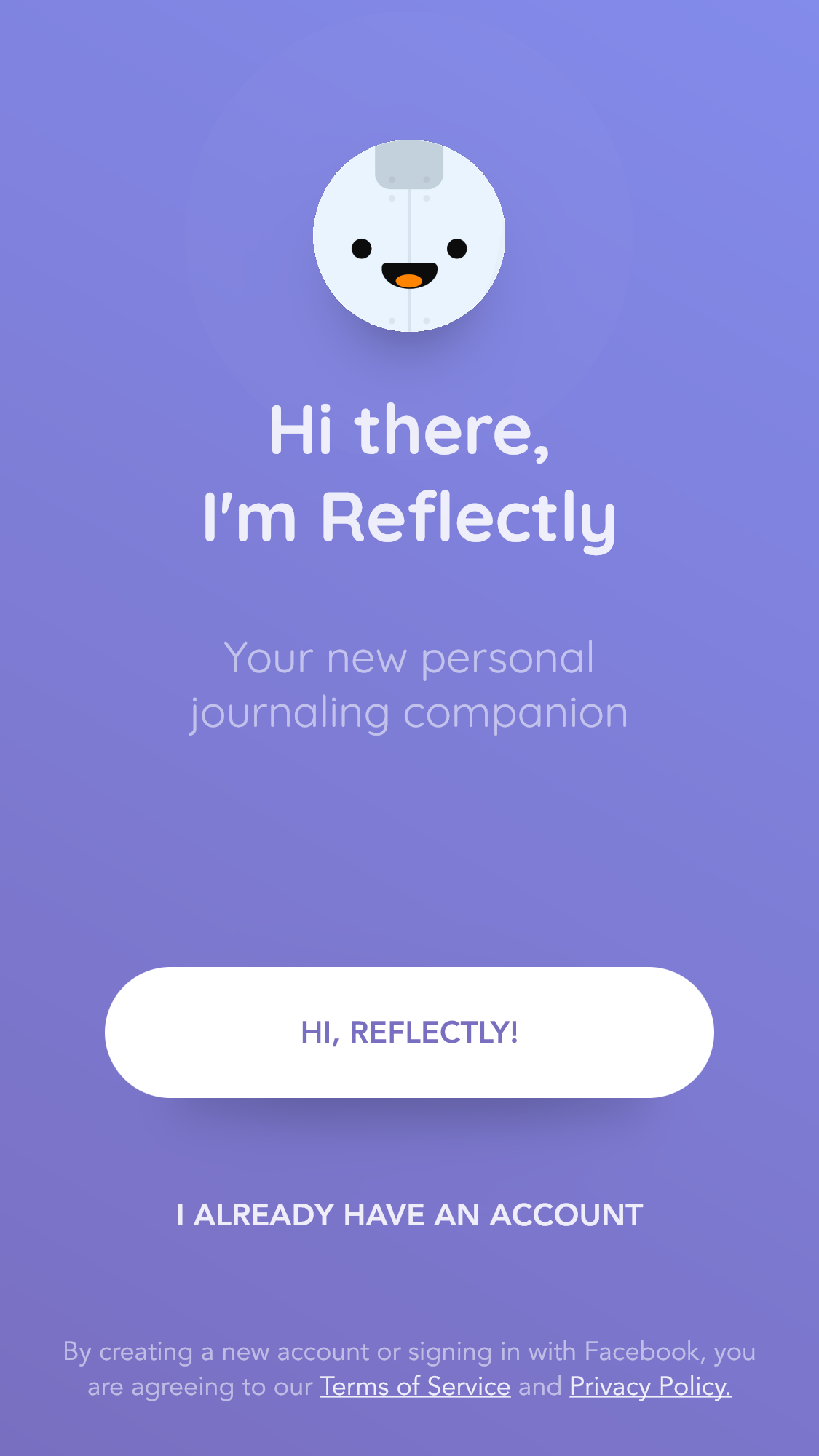
At this point in the onboarding I must take umbrage with how soon I’m being asked to read small text about billing and being asked to buy an annual subscription. Firstly, I’m not sure what value I’ll be getting from the app. Secondly, I can’t explore further without entering into a 1 week free trial. Thus, I set a calendar alert one week from now reminding me to consider cancelling or keeping Reflectly.


Solution
Take some inspiration from Simple Habit and tell a story during the onboarding, which communicates the value and functionality I’ll be getting from the app while at the same time introducing me to the ethos of the app.
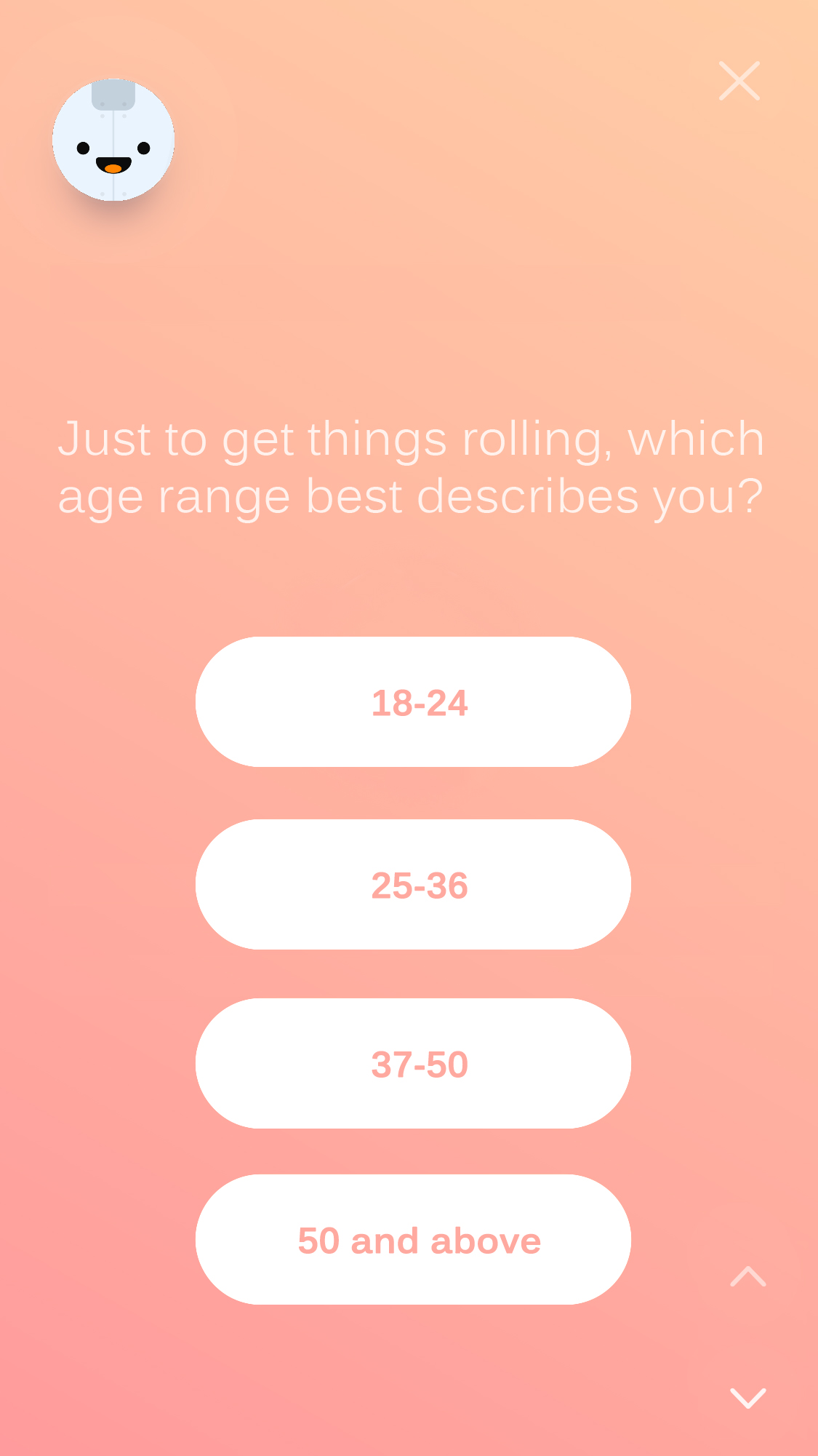
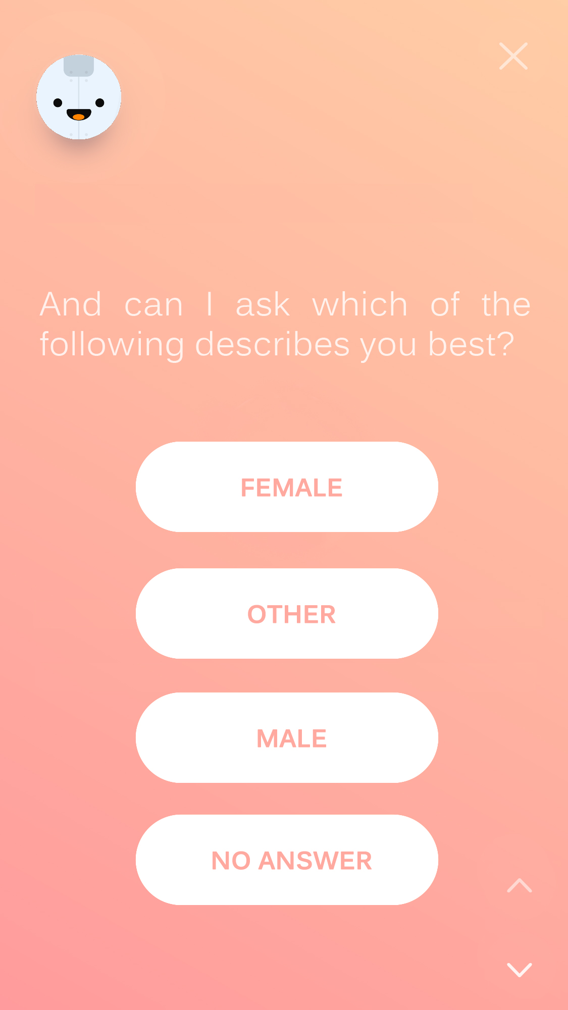
By answering simple but pointed questions
I anticipate a tailored experience


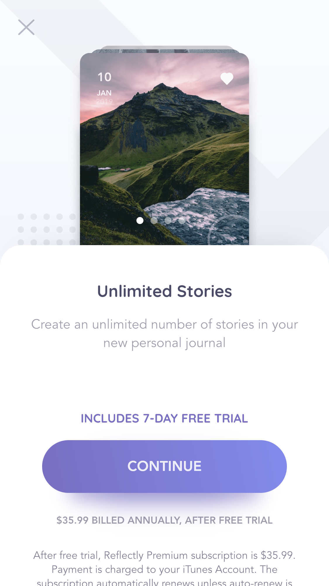
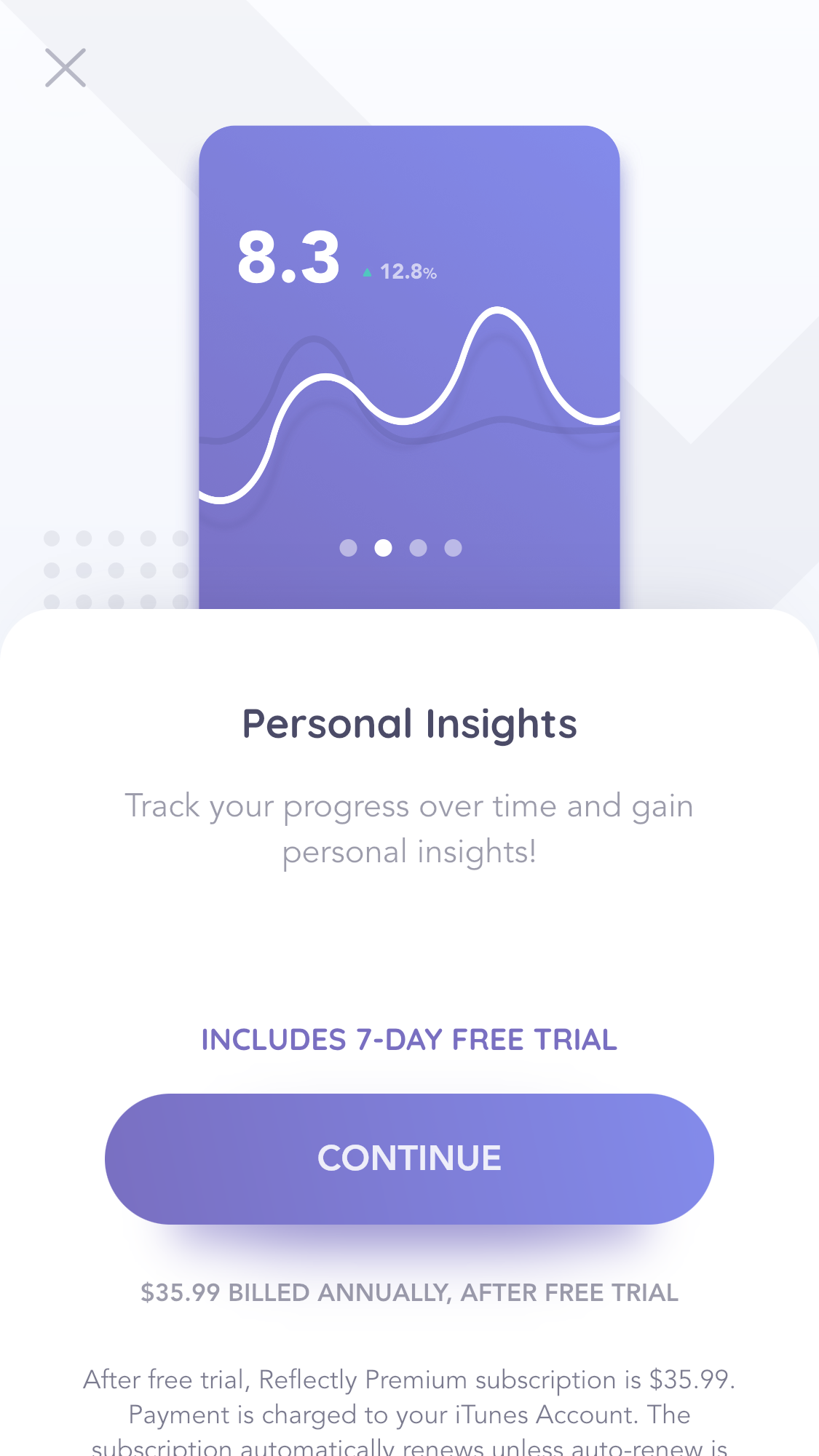
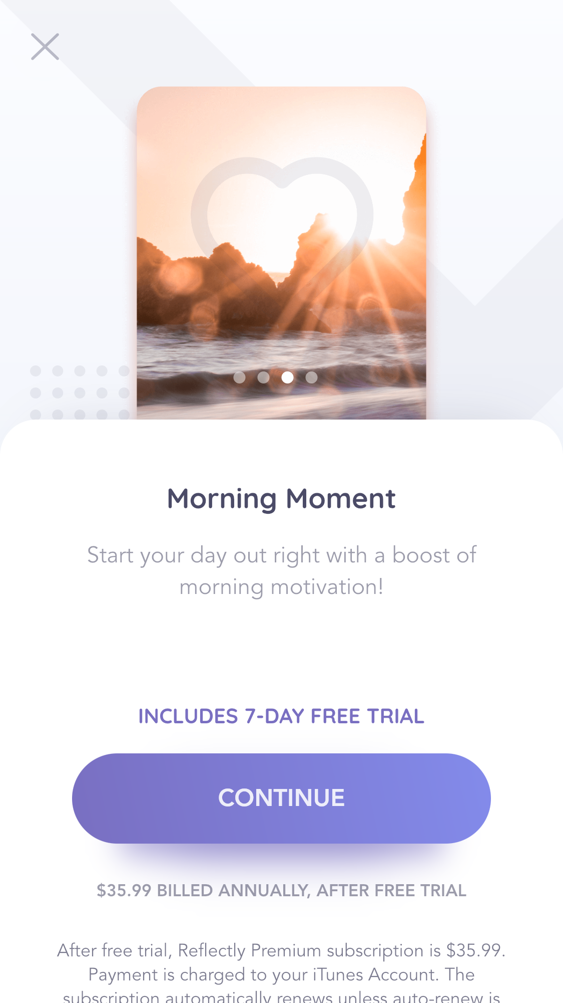
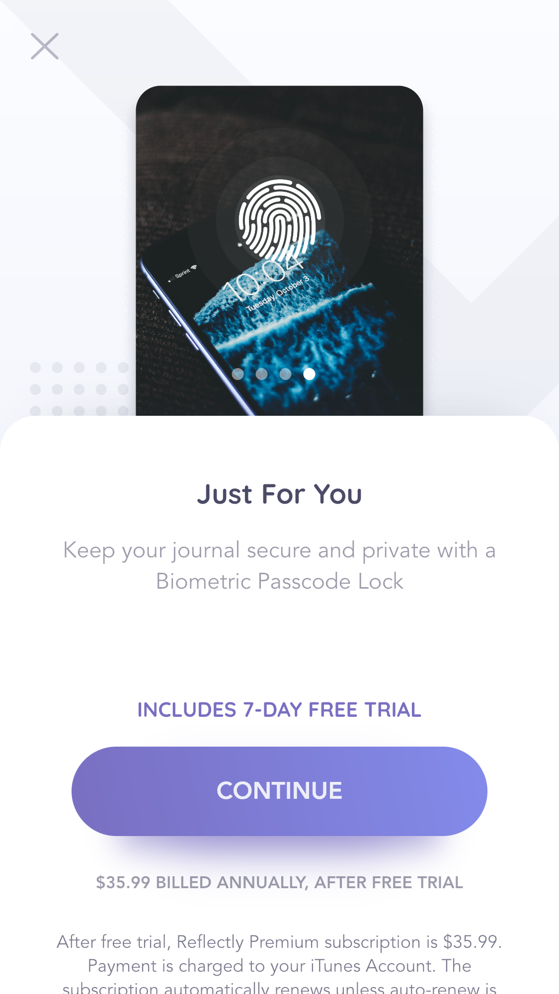
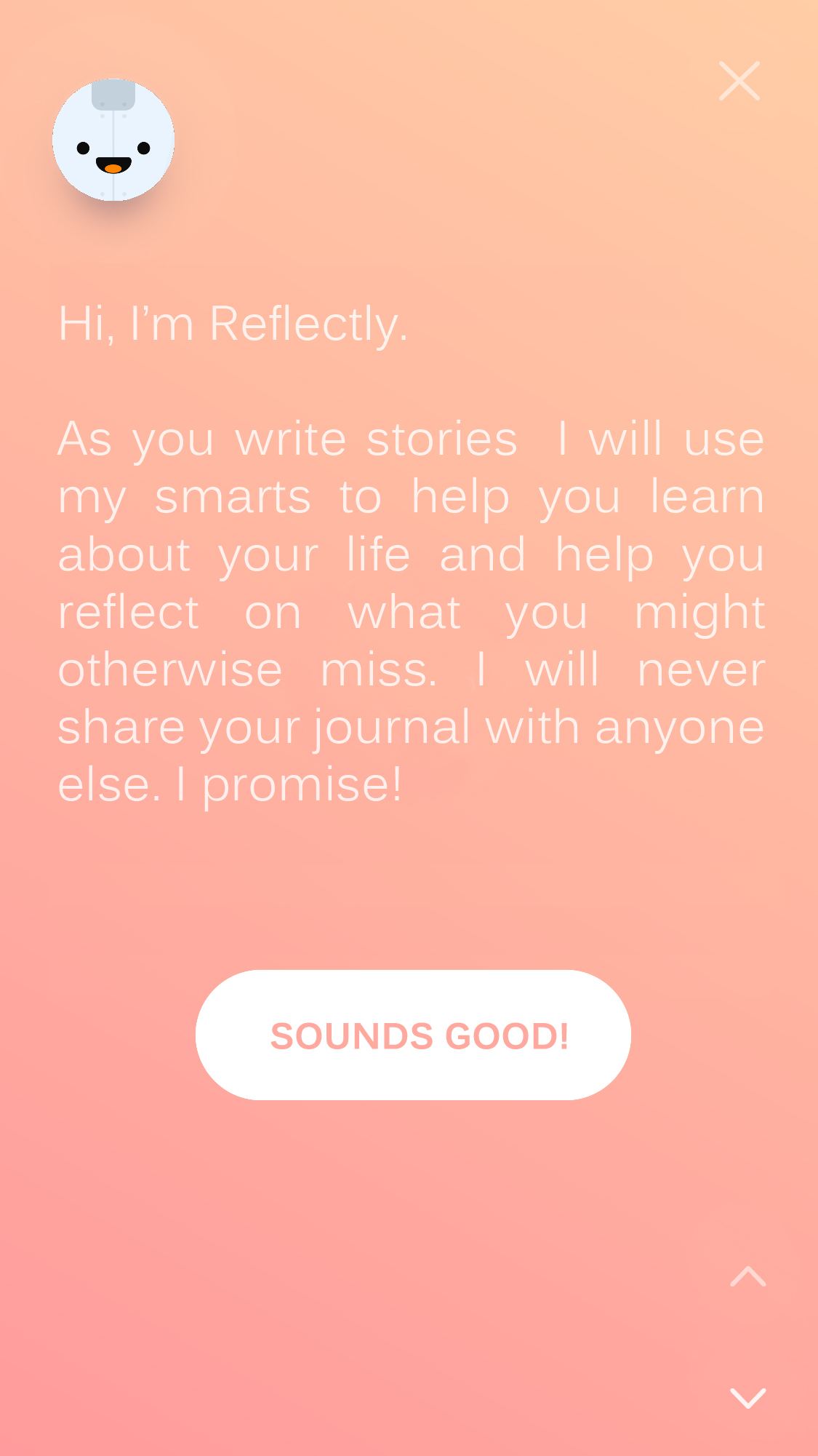
A Brief Look Inside
At this screen, Reflectly does offer some view into what a user will be getting, but it isn’t totally apparent that these blurbs can be swiped through. A remedy would be to make the dot markers more visible.
By not asking me any questions or revealing hardly anything about the app...
I feel no empathy from the app or company
Proposed solution
By loosely describing what kind of A.I. driven insights I might get, the app seems more valuable. By asking a few broad questions I feel empathy from the app and I get the sense my answers will somehow tailor the experience and bring more specific insights, thus I feel more connected to the app already.
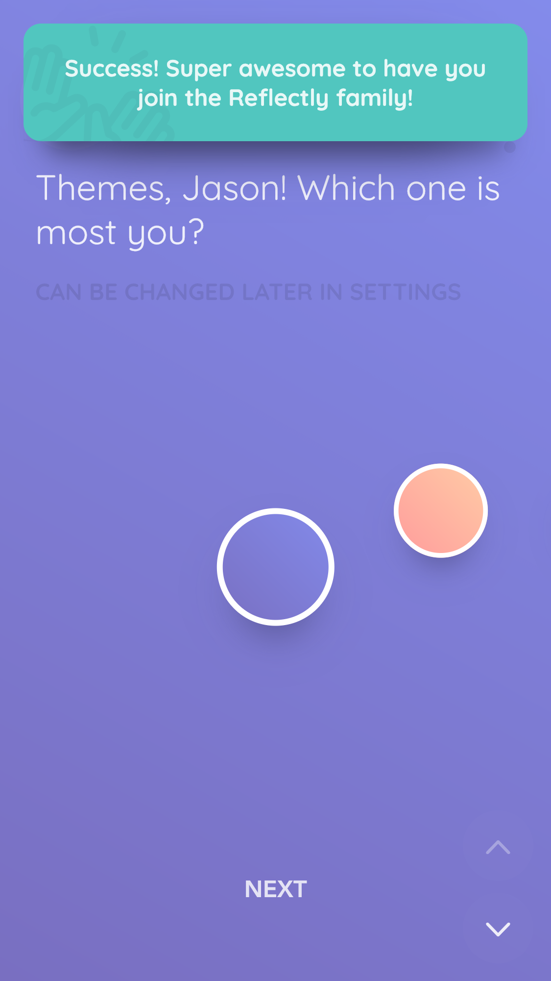
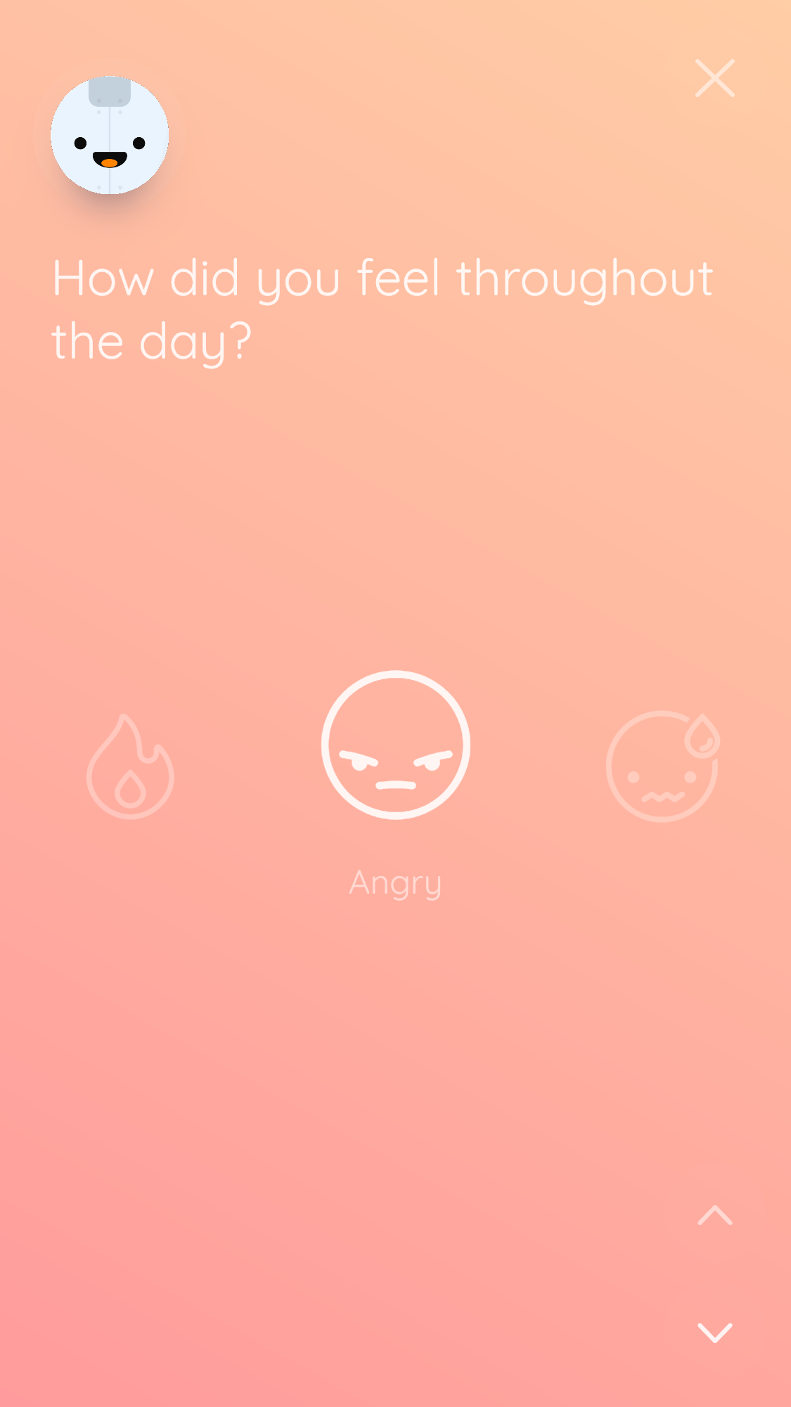
IxD issue
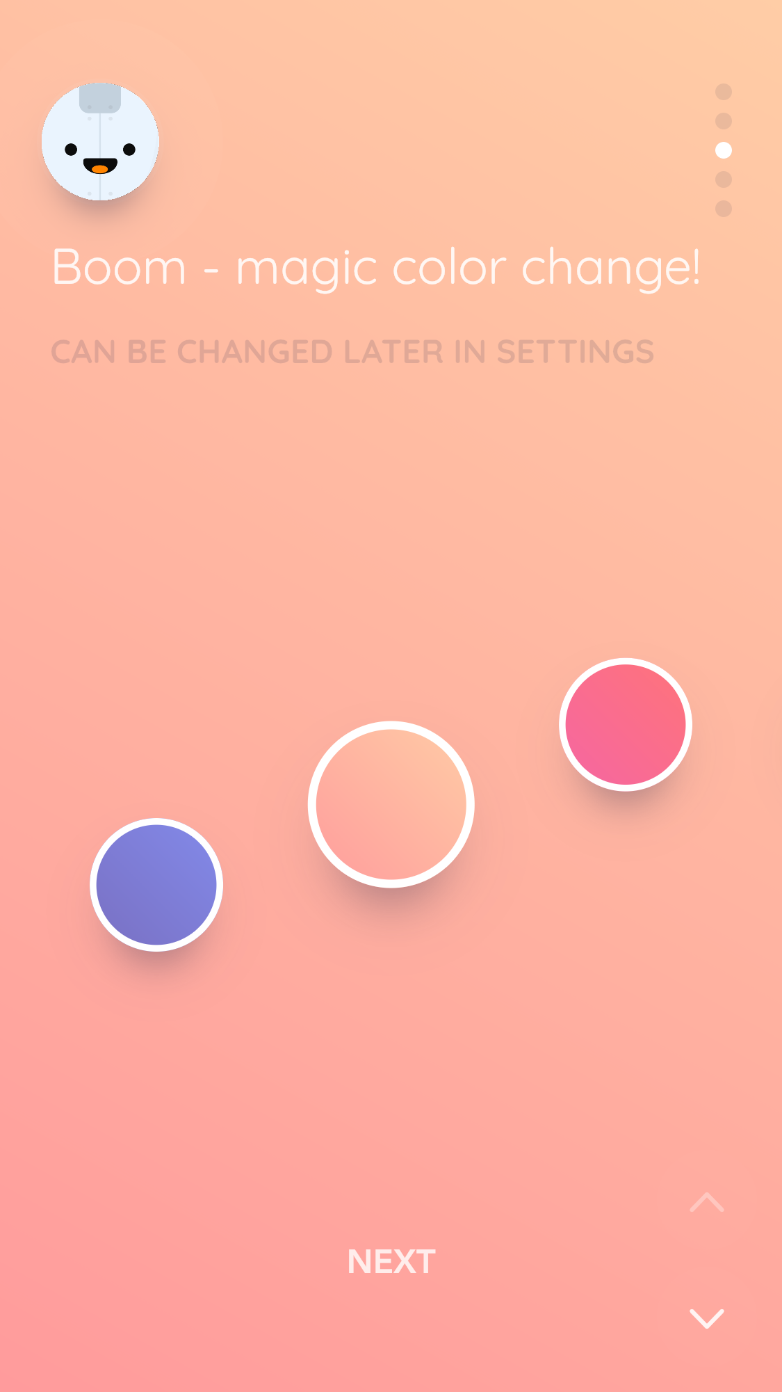
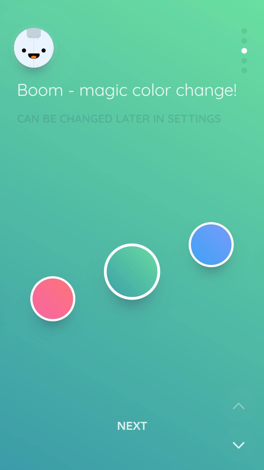
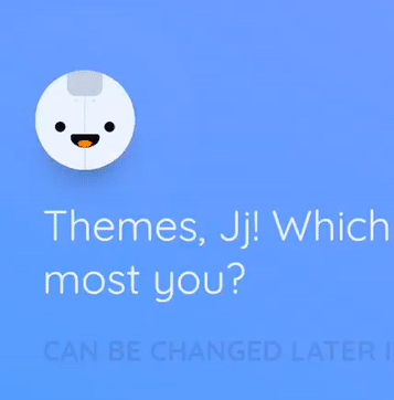
The theme color selection carousel isn’t intuitive. It requires a user to swipe to a color, then press that color to select it. The phrasing is also unclear. Initially I thought that by asking, “Which one is most you?“, the app wanted to know whether my mood was warm or cold. I attempted to press the orange color but nothing happened. This would confound many users.
UI issue
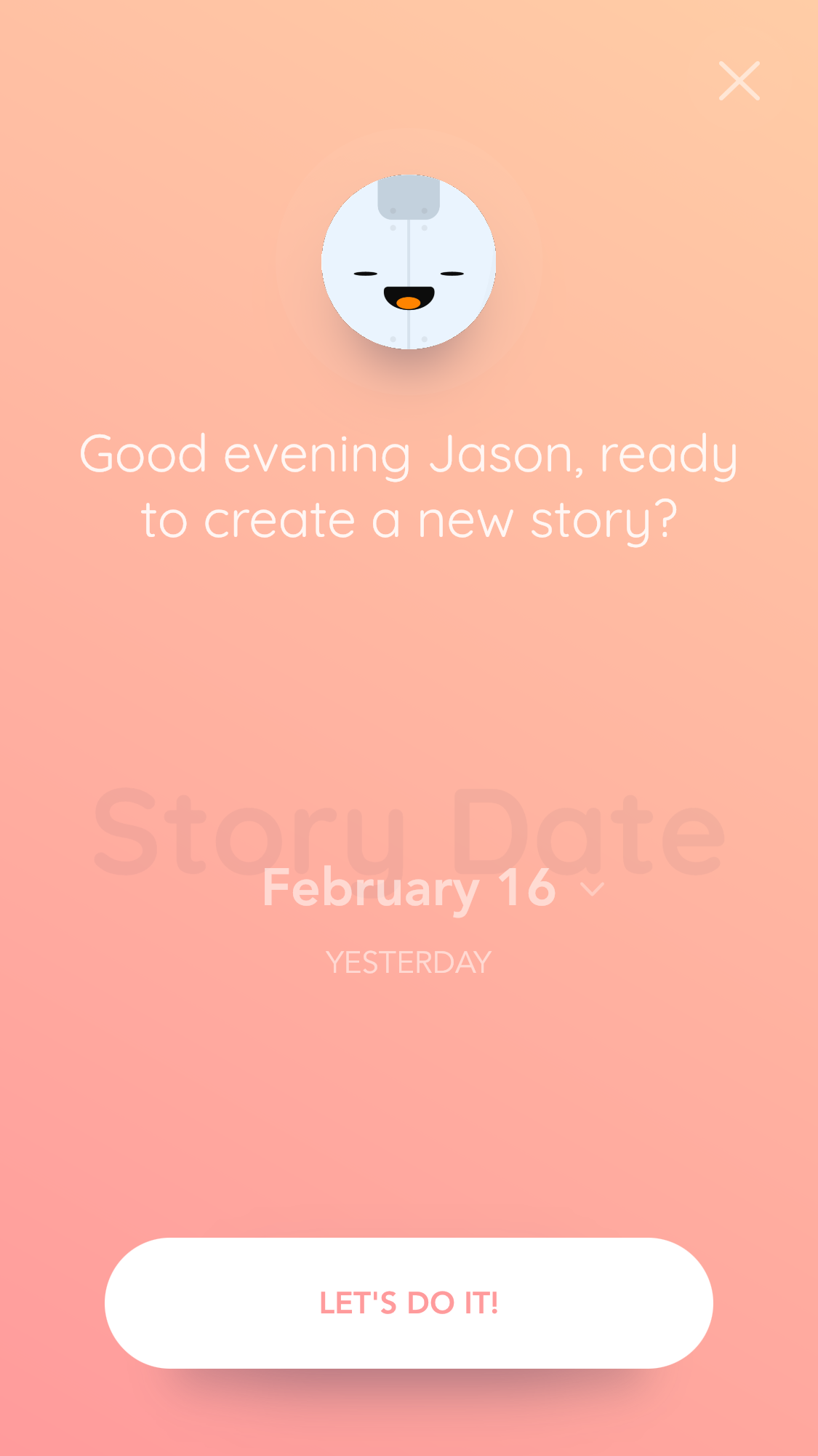
The Reflectly mascot/face seems pressable but isn’t. The radiating ripples make it seem like a button or hotspot with some functionality, like a main menu button or info button. I would at least like to see it shake, wiggle, or bounce playfully when pressed.
UX issue
The face should morph smoothly from one expression to the other. The graphic should be higher fidelity (there is a bit of aliasing on the edges).
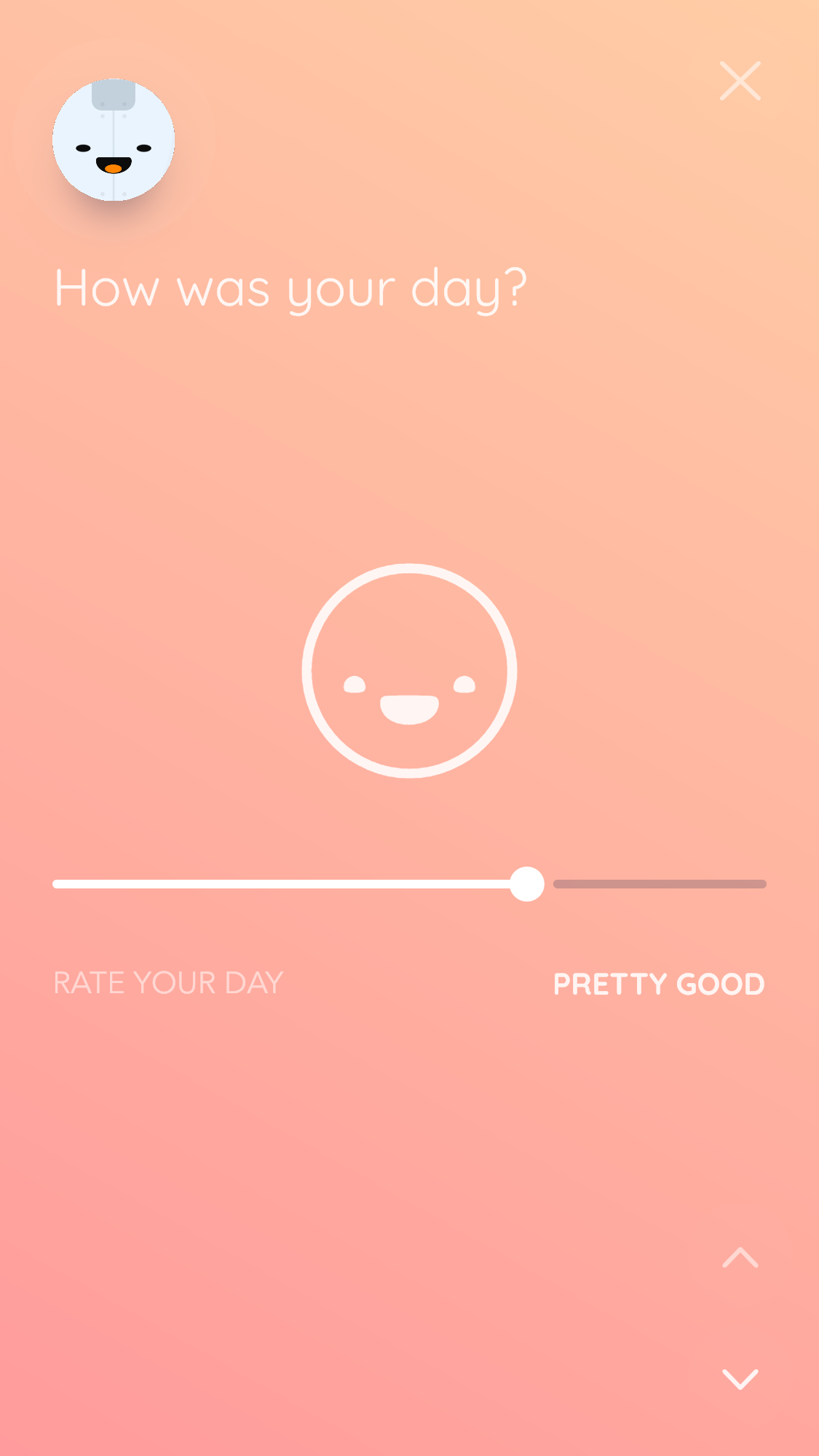


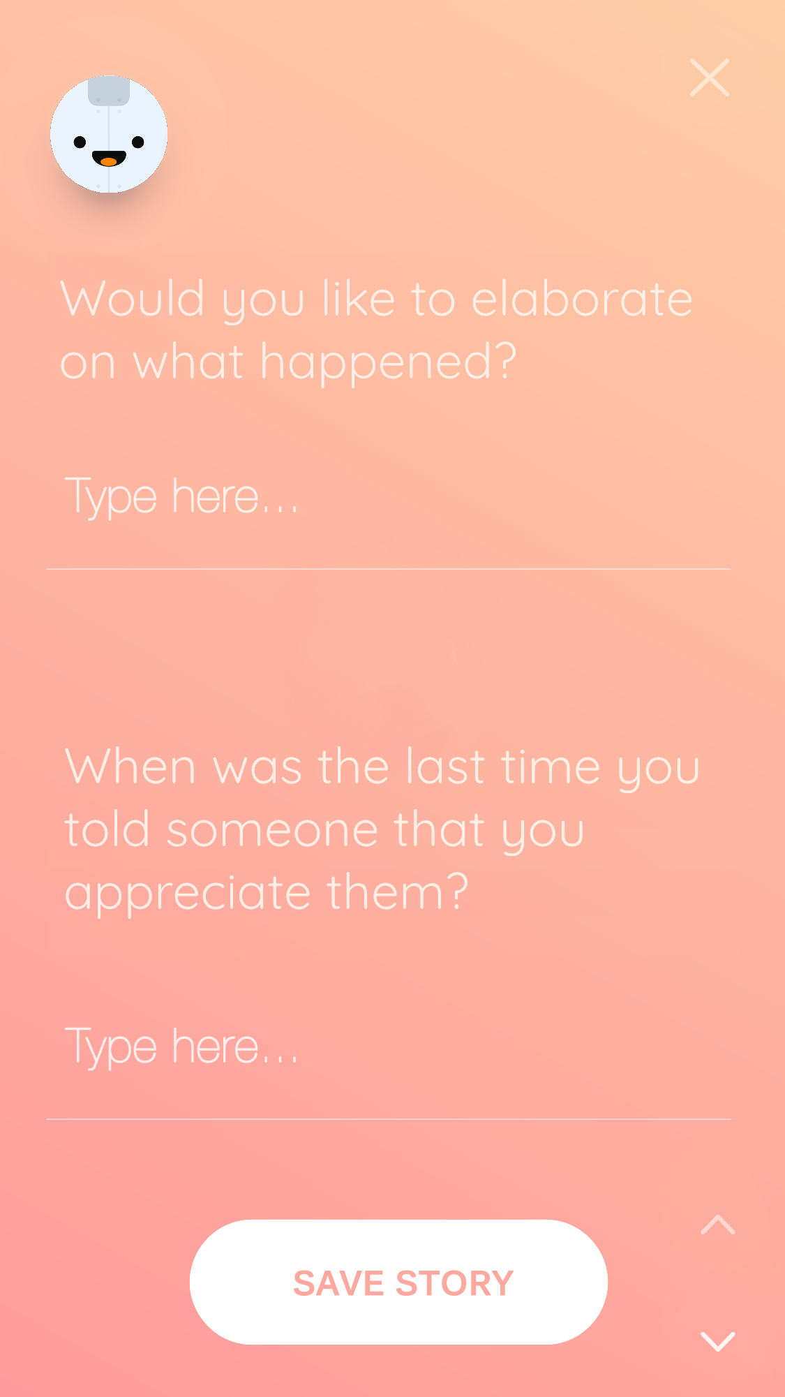
UX/IA issue
There are too many screens and buttons to progress through to enter a story. This is okay the first few times, but it eats up a lot of time. I would like to see it compressed to two total screens, an emotion/mood/event entry screen and then the text of the journal entry.

Proposed solution
Compress the mood/gratitude/emotion entries to one screen and compress both text entries on one screen. Now a journal entry can be made across only two screens. I think this will result in more total entries form users.
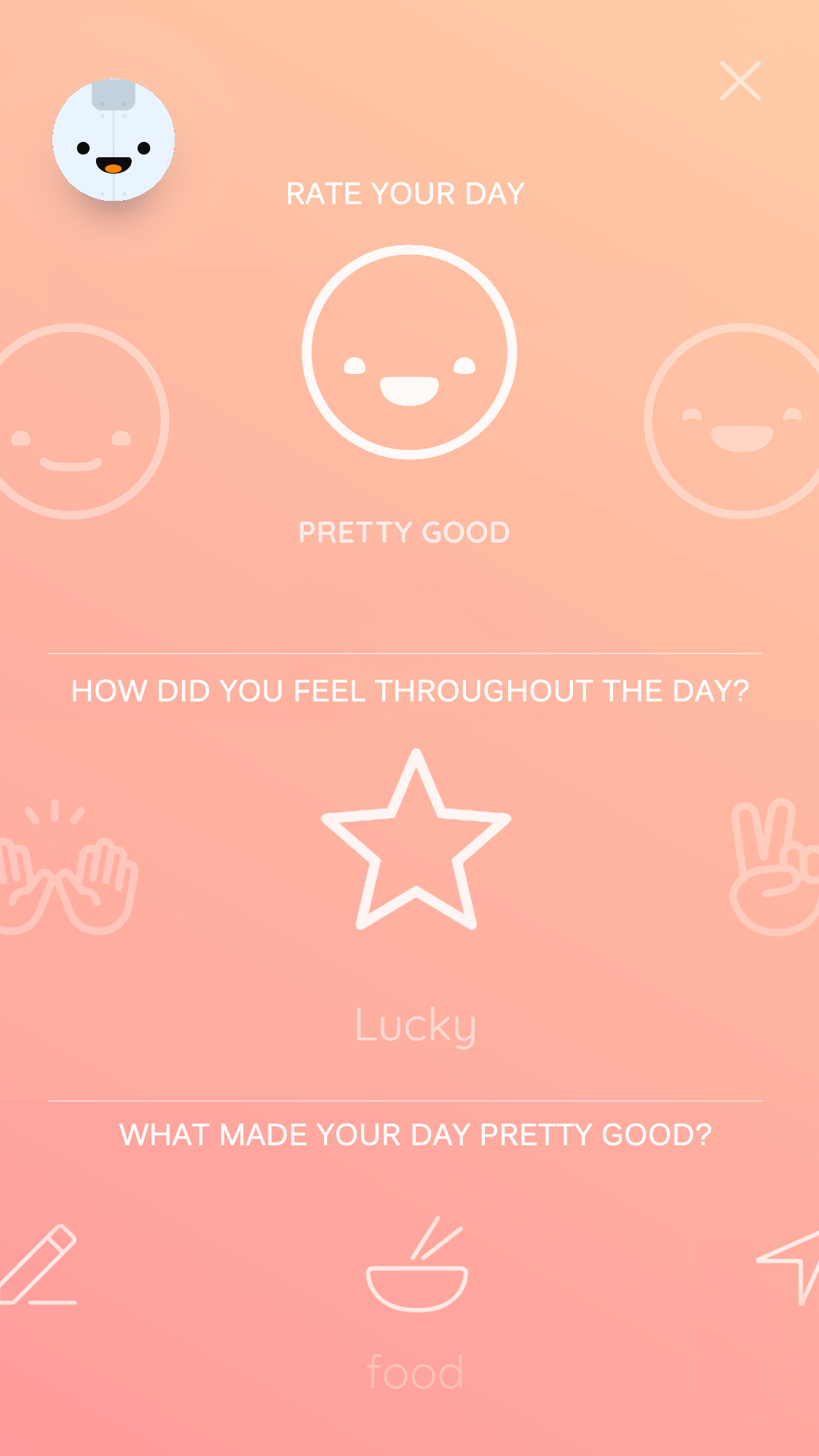
Further development
To make the somewhat busy screen easier to read, have the carousels of choices come into focus as selections are made. The separator lines could also be removed.
1
2
3

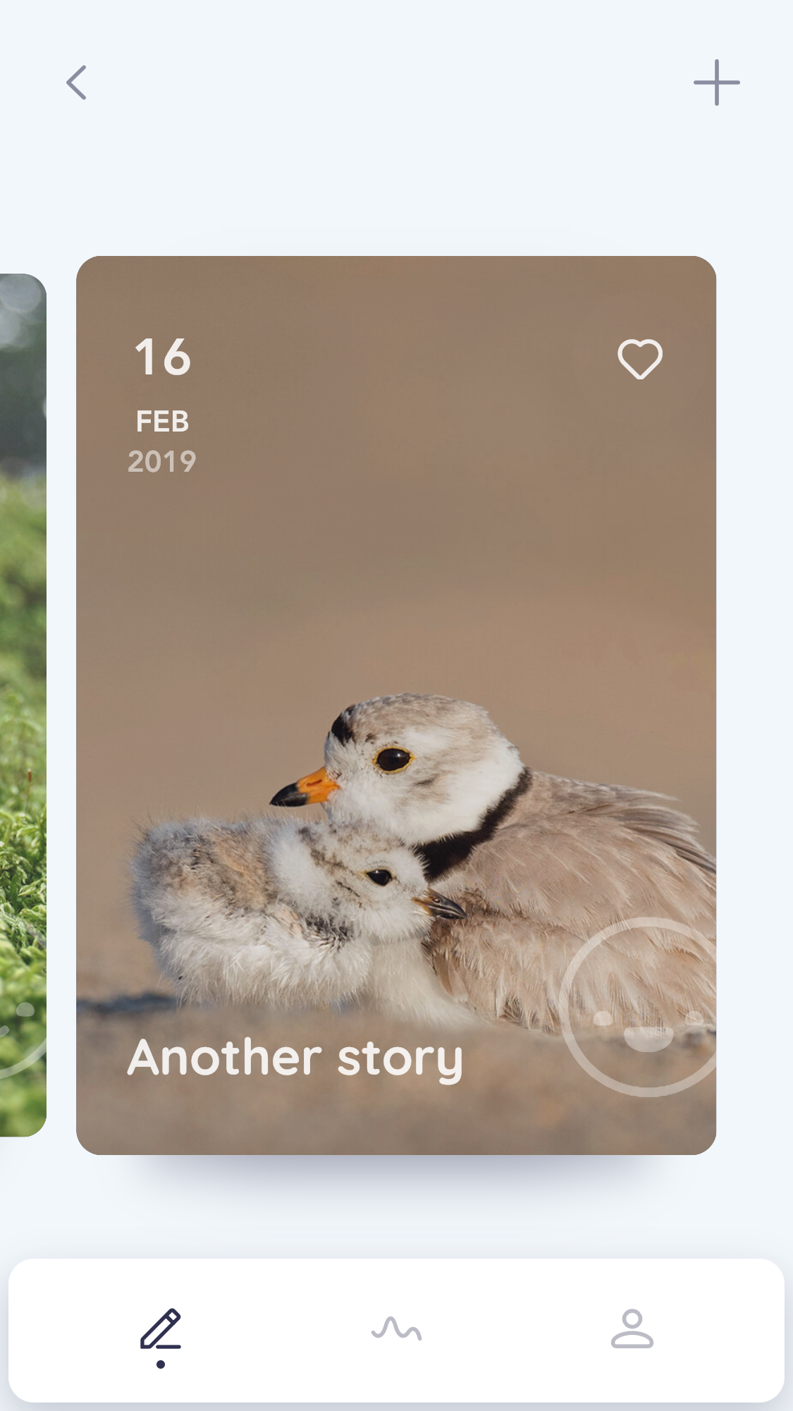
Good UI
I appreciate how when I chose ‘relationship’ as the thing that made my day good, the cover image for the story is set to two animals together. This makes me wonder what other nice surprises the app has in store.